Pink! Thinking about the colour brings a load of (mostly nostalgic?) memories, from my childhood, rushing forward. Everyone, who experience childhood in the 90s, can recall pink was the colour for all things ‘girly’(let’s use ironic brackets here). I reluctantly have to admit I rode the pink wave for 10 months, just before the early 2000s, where my entire wardrobe was–in fact–very pink. Then, common sense, and a teenage rebellion against society’s established standards, kicked in and the pink obsession died in a wave of black. I went on hating pink with feverish passion.
Fast forward to a few years ago. Pink crept back into my designs and I wasn’t as opposed to it anymore. That was before the entire world went pink-mad.
We all know this story. The Barbie movie came out and we can’t deny, last year, pink was everywhere. The world was drowning in Barbie pink! Remember when Burger King launched a pink burger?
“When you are able to create recognizable promotion with just a color and a font, the world is your #sponcon oyster. If it’s pink, it’s Barbie.”
Curbed
Is it synonymous with Barbie though? Pink has undergone multiple gender conversions through history and within the fashion industry, is associated with rebellion and irony, as well as playfulness and tenderness. So, is there still a place for pink in design?
Pink for power
The origins of pink take us back a few centuries. Its earlier associations to power, royalty and war are the exact opposite of how the colour is perceived today.
“...pink was considered a masculine colour for some time. Red has long been seen as the shade of masculinity, linked with power and warfare due to its associations with fire and blood, and commonly worn by samurai in Japan and soldiers in China and Europe. It was therefore not uncommon to see men from high society wearing pink…”
Flipped and subverted
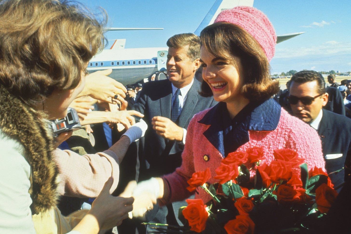
In the 20th century, pink’s cultural associations underwent a series of rapid overhauls. At some point brands and marketing firms began to denote pink as a colour for women and baby girls. This took off, bolstered by the success of female icons wearing the colour pink, such as First Lady Jackie Kennedy in her famous pink suit.

The birth of ‘Barbie pink’
Around the 1970s, Mattel started to use what is now known as Barbie pink in its packaging. And if you are getting confused, then let’s clarify that Barbie existed 10 years prior to Mattel’s pink era. The colour was chosen for its cheerfulness and association to female power. Barbie was the original girl empowerment brand. Through its consistent use in branding and packaging, Mattel acquired distinctiveness for Barbie Pink. Any girl (or woman) in the world today associates the shade with its dolls and accessories.
After the release of the Barbie movie, the shade acquired its own fashion movement, Barbiecore. A trend that rose in waves of nostalgia, making a statement both against and for plastic. For some, the shade represent a nod to their childhood, and for others it’s an ironic stance against the doll and unrealistic beauty standards.
Pink today
The associations of pink are always in flux, but there’s one constant. It’s cultural power: pink is a statement.
“Think back to 2017 and all the pussy hats at the Women’s March paired with rallying cries like “pussy grabs back” in response to former President Trump’s notorious Access Hollywood tape.”
Pink is a colour that sparked global conversations around identity. For millennials and Gen Z, it’s a gender neutral colour. It features in fashion for both genders and a lot of brands are confident in using pink shades.
“Around the world, pink can mean different things to different cultures. In South Korea, pink symbolizes trust. In Latin America, colonial-era architecture favors shades of pink. In Japan, pink is worn by more men than women.”
Depending on the shade, pink can communicate different ideas. There’s a shade of pink to suit any message. I’ve also dropped here a few brands that lead with pink, each owning their personality and being vastly different from each other. They’ve also all existed prior to the Barbie craze noted above.


Can we build new associations around pink?
In my mind pink is the colour of rebellion (think about the famous Sex Pistol’s cover). It’s the odd one out, the one that screams for attention and can convey so many diverse meanings. I’m not saying “let’s use pink on every project”. But there is a time and place for it.
Colour choices come to play an important role in shifting social stereotypes. The question we need to ask ourselves is: Can we build new associations around this colour? I think so! As proven by the media, brands and the younger generation’s fashion choices, colour becomes only what we allow it to be. Just because we’ve build certain associations around it in the past, doesn’t mean that we need to stick to those outdated ideas.
Design is about reinventing the norm. It has the power to trigger change. If we are not the one to lead that change, then who will?
Three pink things
🩷 If you haven’t had a look yet, Klarna’s brand guidelines are very fresh, pink, bold, and totally worth checking out.
🏳️🌈 Pink news is a go-to LGBTQ+ world-wide take on current affairs.
📕 Written by a diverse team of authors, Extra Bold is the critical book that rethinks design principles and practices through theories of feminism, racism, inclusion, and non-binary thinking.
You can follow ABNORM at @abnorm.bydesign, a playground of ideas, type experiments and design thinking.


